This theme.json custom CSS tutorial was written for all of those who are asking “how to add custom CSS in block themes” and want to learn how to seamlessly navigate block theme editing.
You can’t develop a good-looking website without adding custom CSS. Period.
That being said, how do you add custom CSS in a block theme that uses theme.json for styling?
If you’re stuck with block theme editing on a use case where you want to add custom CSS, here’s a step-by-step guide about theme.json custom CSS settings.
Understanding WordPress theme.json file
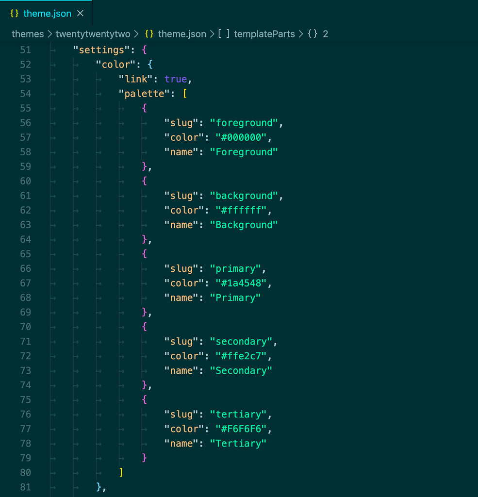
The WP theme.json file in WordPress block themes is a JSON (JavaScript Object Notation) file that allows theme developers to configure global settings and styles.
This centralized configuration file is instrumental in managing the look and feel of a WordPress site, making it easier to apply consistent styles and settings.

We have written detailed tutorials on how WP theme.json works and about the structure and layout of the theme.json file.
Read: How to Add Google Fonts to WordPress using Theme.JSON
If you know the basics of WP theme.json configuration, continue reading this tutorial on theme.json custom CSS.
Here’s a step-by-step guide on how you would define a custom CSS property and implement it to style your website.
Step 1: Adding Custom CSS Property in Theme.JSON Custom Setting
To add custom properties, you’ll navigate to the settings.custom section of your theme.json file. Here, you can define your CSS variables (custom properties) that you’ll use throughout your theme.
Here’s an example of a basic custom CSS property defined in settings.custom section.
{

 "version": 2,

 "settings": {

 "custom": {

 "color-primary": "#0073AA"

 }

 }

}
In this example, we’ve added a custom property named color-primary with a value of #0073AA, which is a shade of blue.
WordPress will automatically generate this as a CSS custom property in the format –wp–custom–color-primary: #0073AA;.
This makes it accessible throughout your theme for use in styling.
For more granular control, especially when you want to define a palette of related styles, nested properties come in handy.
Let’s extend our example to include a full set of color properties for your theme, including primary, secondary, and accent colors.
{

 "version": 2,

 "settings": {

 "custom": {

 "colors": {

 "primary": "#0073AA",

 "secondary": "#59BACC",

 "accent": "#FFAE00"

 }

 }

 }

}
Here, under settings.custom, we define a nested object called colors that includes three key-value pairs for primary, secondary, and accent colors.
WordPress will automatically convert these into CSS custom properties:
- –wp–custom–colors–primary: #0073AA;
- –wp–custom–colors–secondary: #59BACC;
- –wp–custom–colors–accent: #FFAE00;
These custom properties provide a systematic way to apply and manage your theme’s color palette with theme.json.
Defining Theme.JSON Custom CSS Properties Alone Is Not Enough
This is an important thing to understand about the theme.json custom css settings.
The custom properties you defined in your theme.json file under settings.custom section will not have any effect unless you use and apply them in your theme’s styles.
Here’s what you need to know:
Custom properties are just definitions. When you define a custom property in theme.json, you’re essentially creating a variable that holds a specific value, like a color code, font size, or line-height.
This variable doesn’t do anything by itself; it needs to be called or applied to an element or a style rule to have an effect.
For the custom properties to be effective, they must be applied to global styles, elements, or specific blocks within the theme.json file.
This involves using the var() CSS function to incorporate the custom property into your theme’s design, as shown in previous examples.
Similarly, if you’re working with traditional CSS files (like style.css in your theme), you need to use the custom properties in your CSS rules.
Again, this is done using the var() function to insert the value of a custom property into your CSS declarations.
Custom properties, or CSS variables as they’re often called, are powerful tools for maintaining consistent styling across a website.
However, their true utility comes from their implementation within your theme’s CSS or directly within the theme.json file under the styles section.
Step 2: Using the CSS Variable to Apply the Custom CSS Properties
After defining custom properties in theme.json, the next step is to apply these styles to your theme. You can do this globally across your entire site or target specific blocks for more precise styling.
Let’s use the custom color palette we defined in the previous step as our example for applying custom properties in theme.json styles.
Given we defined a color palette with primary, secondary, and accent colors, here’s how you would use those custom properties to apply styles globally and to specific blocks.
Applying Custom Properties Globally Using the Color Palette
To apply our custom color properties globally across your theme, you might want to set the primary color as the global text color and the secondary color as the global background color. Here’s how you could do that:
{

  "styles": {

    "color": {

      "text": "var(--wp--custom--colors--primary)",

      "background": "var(--wp--custom--colors--secondary)"

    }

  }

}
How is this Code Working?
- “styles”: This section is where you define both global and block-specific styles.
- “color”: Targets color settings, including text color and background color.
- The var(–wp–custom–colors–primary) and var(–wp–custom–colors–secondary) functions retrieve the values of the custom color properties we defined earlier. By applying these globally, all text elements across your site will use the primary color, and the background will use the secondary color, ensuring a consistent look.
Targeting Specific Blocks with Custom Properties
You might want to apply the accent color to specific blocks, like the heading blocks, to make them stand out. Here’s an example of how to set the text color for all heading (core/heading) blocks to the accent color:
{

  "styles": {

    "blocks": {

      "core/heading": {

        "color": {

          "text": "var(--wp--custom--colors--accent)"

        }

      }

    }

  }

}
How is this Code Working?
- “blocks”: This section allows you to apply styles to specific blocks.
- “core/heading”: Specifies that we’re targeting the heading block.
- Applying var(–wp–custom–colors–accent) to the text color of heading blocks makes all headings use the accent color defined in our custom properties. The var() function is used to insert the value of a custom CSS property into your theme’s styles. This approach ensures that your color scheme is consistent across your website and easily maintainable through theme.json. If you ever change the website’s color palette, you can change the color code in theme.json custom setting and it will be applied everywhere.
This example illustrates how custom properties, once defined, can be effectively used to apply and manage styles within your WordPress block theme, leveraging the color palette defined in the previous step for practical and visual impact.
Step: Applying Theme.JSON Custom CSS to Custom CSS Classes
This step takes it further and explains how to leverage the theme.json custom CSS properties defined within your custom CSS classes.
These classes can then be added to HTML elements or blocks within your WordPress editor or templates, allowing for versatile and reusable styling options throughout your theme.
Define Custom Classes in Your CSS
First, you’ll need to create or edit your theme’s CSS file (typically style.css in your theme’s directory) to include the custom classes that utilize your theme’s custom properties.
Suppose you have defined custom colors in your theme.json as we discussed earlier. You can now create custom classes in your CSS file that apply these colors in various ways.
Example CSS:

.accent-text {

  color: var(--wp--custom--colors--accent);

}

.primary-bg {

  background-color: var(--wp--custom--colors--primary);

}

.secondary-border {

  border-color: var(--wp--custom--colors--secondary);

  border-width: 2px;

  border-style: solid;

}- .accent-text applies the accent color to the text of any element with this class.
- .primary-bg sets the background color to the primary color for elements with this class.
- .secondary-border adds a solid border with the secondary color to elements with this class.
Applying Custom Classes in WordPress
After defining your custom classes, you can apply them within your WordPress site in several ways:
- In the Block Editor: Many blocks allow you to add custom CSS classes through the block’s “Advanced” settings panel. Simply enter the class name (e.g., accent-text) to apply the styles to that block.
- In Templates and Theme Files: If you’re editing PHP template files or creating custom HTML templates, you can add your custom classes directly to the HTML elements. For example, <div class=”primary-bg”>Content Here</div>.
Applying custom CSS to custom CSS classes is a powerful step in theme development that bridges the gap between global styles defined in theme.json and the need for specific, reusable styles across your WordPress site.
Wrapping up the Theme.JSON Custom CSS Tutorial
This tutorial has walked you through the essential steps of adding and applying custom CSS in WordPress block themes using the theme.json file.
Starting from understanding the role and structure of the theme.json file, we’ve covered how to define custom CSS properties, apply these properties globally and to specific blocks, and finally, how to leverage these properties within custom CSS classes for more targeted and versatile styling.


![Contact Form 7 Formatting in WordPress [How to Do it The Right Way] Contact Form 7 Formatting in WordPress [How to Do it The Right Way]](https://wpdesc.com/wp-content/uploads/2024/07/Contact-Form-7-Formatting-in-WordPress-1024x512.png)
![How to Redirect Contact Form 7 to Thank You Page [2 Easy Ways] How to Redirect Contact Form 7 to Thank You Page [2 Easy Ways]](https://wpdesc.com/wp-content/uploads/2024/07/how-to-redirect-contact-form-7-to-thank-you-page-1024x512.png)
![How to Add reCAPTCHA to Contact Form 7 [2 Easy Steps] How to Add reCAPTCHA to Contact Form 7 [2 Easy Steps]](https://wpdesc.com/wp-content/uploads/2024/07/how-to-add-recaptcha-to-contact-form-7-1024x512.png)

Leave a Reply